

In the past we have presented our readers with some inspiring and well designed infographics to demonstrate this useful presentational route that many are taking these days for content delivery. By taking statistical data that would normally be dry and otherwise lacking, and designing the information in such a way that it becomes not only more digestible, but also exciting and somewhat interactive.
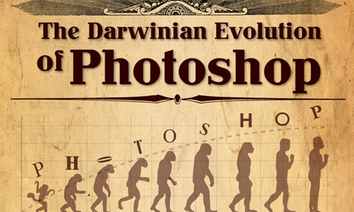
The Darwinian Evolution of Photoshop
How to Avoid an Online Customer Service Fiasco

The Most Popular Design Blogs by Twitter Followers and Facebook Fans

How a Phone is Phished

The Infographic of Infographics: How Infographics are Made

Web Developers vs. Web Developers

App Store Milestone: 500,000 Applications Approved

Which Designer Job is the Best?

Demand Media Breaking the Bank

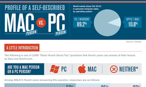
Mac vs. PC: A Hunch Rematch
What Your Web Design Says About You

Web Design Evolution: Two Decades of Innovation

How facebook is reshaping college admissions

Graphic Designer’s Journey: Freelance To Freedom

April Fools 2011: Pranks Around The Web

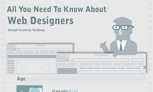
All You Need To Know About Web Designers
The Complete iPhone 5 Rumor Roundup

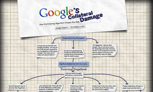
Google’s Collateral Damage
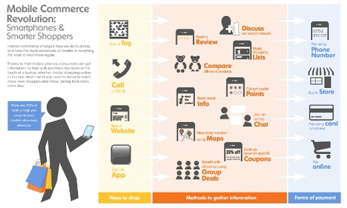
Mobile E-Commerce Infographic
Lists Are Dead. Long Live the Blog Tree

Women in Business

World Without Apple

Different Types of Designers and Developers

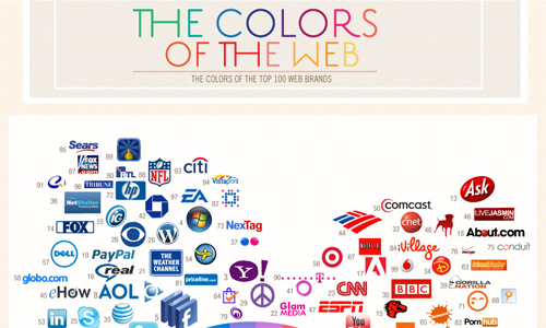
The Colors of the Web
So… Enjoy and give us your feedback.
[box type=”note” align=”aligncenter” ]We would love to hear your opinion, so please comment below. And don’t forget to subscribe to the RSS-feed and follow Pixel2Pixel Design on Twitter + Facebook (100% Spam Free!).[/box]
